Wednesday, December 16, 2015

Semester Reflection

Description

For my first semester I worked on many projects both in class and outside of class. I created name plates, homecoming posters, and fantasy companies in class. Outside of class on my own time I created fake tattoo prints, some t-shirt prints and a logo for a friend. 

Reaction

During the name plate class critic, I was so scared because this is something I have never done before let alone the fact that my class would see and tell me about my work. Last year I would always take the short way out of some project like having an extra shape to cover up something rather than going though and fixing the problem completely. At first I didn't like taking the time to fix a problem instead of a quick cover up but them after seeing how other people do go through my files to see how I have done something makes the project better as long with spending  the time on it. Looking back, it is an extremely helpful class activity that everyone can benefit off of especially when they don't see the same exact image I was thinking of.  

Evaluation

Some of my favorite projects are collaboration projects across different strands. Last year I worked on a lower third for ONW Now, this year I created the logo that ONW Now will be using in an animation for an intro; a small little segment for 'Coffee with Taj'. For this project an animation student Ian and I worked together to create a logo and animate it to look like foam on a coffee cup. This project was extremely confusing when we used two different adobe suits to create it. I used Illustrator to vector out a screen shot of the clip Ian will animate on and then I sent it over to him so he can animate it in After Effects. I constantly asked for his opinion on my vector to make sure it is what he wanted and try to get a grasp of what Taj wanted too. 

Another conflict that happened upon me was when I learned that over the summer when all the computers were updated, Adobe decided to take the file recovery off of Illustrator but for some reason still kept it on photoshop. While working on my homecoming poster, the app crashed and my week of work was sent into the void. I spent every day after school trying to catch up. The lesson I learned was to save frequently. On a happier note I also learned that Illustrator has an auto save option that I now triple save just to be safe.

Learning

Before this year I never used Dreamweaver, I have only seen it. Now in every project i create I use it for my back plate. Its small but it is nice to use it to make in my case, something small. I also learned so much more with Illustrator along with brushes and packs I can bring into the app to work with. I leaned how to create a bit map and properly use one and transfer it between projects because it is a texturing formate that can work in most Adobe Suits. 

In the class we usually work on about two projects at a time both class and client work and need to learn to manage our time and projects. This works great since this class is a two hour class so I learned that I can split my time evenly with two projects. Working with three I prioritize the one with the closest due date and the split up the remaining time with the other projects I am also currently working on. 

Action Plan

Next semester I hope to improve my skills as a graphic designer and take on more client work before graduation. My goal is to brand myself and reach for endorsement hours. I hope to learn more about not just printed graphics but graphics on the web and how to integrate it into my website.  

Gestalt Design Principles


Gestalt means 'unified whole'; in any kind of design that is a key concept to catch the eye. Every great design must contain one of the following principles:

1)Similarity
2)Continuation
3)Closure
4)Proximity
5)Figure/Ground
6)Symmetry and order

The author identified the key concepts as to catch a person's attention to simplify a design using the above six principles. The sources used is cited from Rudolf Arnheim and his book Art and Visual Perception: A Psychology of the Creative Eye. Giving visual representations of the six principle helps the reader understand and acknowledge the principles. What is lacking from the author's argument is the use of other images or possibly a combination of two rather than trying to imagine what that would look like. In conclusion the article gives examples and short descriptions that allow the image to give the better example. 

Supporting the author's argument the article does give written and visual examples along with cited appropriate examples to support his argument. For the most part, the evidence is convincing but for the sixth principle and image. To me, the color wheel is not symmetric vertically or horizontally but is symmetric from the center point through a repetitive patter and overlay of the same shape but different color is not entirely symmetric. 

Coming from a psychologic stand point: in order to create a better design for the human eye, the human brain simplifies and identifies the image as either pieces or a whole, the human brain prefers a 'whole' piece so creating a 'unified whole' therefore is visually appealing to the brain and eyes. Using the six principles from above are visually explained through the work of Rudolf Arnheim and his book Art and Visual Perception: A Psychology of the Creative Eye.


Sunday, September 27, 2015

Name Typography


Typography is the art and technique of arranging type to make written language legible, readable, and appealing when displayed.

Name typography is using the art and technique with your name, giving your personality to the text itself. 


We were tasked with writing 20 statements about ourselves and then drawing 3 sketches for each statement. Then we picked 12 of the best ones and recreated those in Illustrator. 


These were my 12 without any wording. 


These two below are my favorite and I can't pick which one I like best. The one to the right is for my love of music (the font is Paramore Album and the arrow and line is from Anavae), the one to the left is a remake and entirely vectored font of my name put in the Nightwing logo.


The Final Print


Creating these name plates helps us understand the importance of choosing the correct type of font and matching it with how the word is used. 

Example; "My name is Faith, and I will out scream the cicadas." The font I chose was decible because it looked loud and screeching which matched my words 'out scream'. 


Tuesday, May 19, 2015

ID Package

As the end of the year approaches, we were face with the problem of marking our progress as Graphic Designers. I am finishing up my Junior year and setting a bar which I need to surpass next year as my Senior year grows near. 

Junior ID Package

Logo RE-Design


At the beginning of my Sophomore year I created a logo which I've decided to redo and try and improve. The original was used with the wrong color codes and look awful compared to the new and improved colors.

These are my new logos.

My official Logo
The reason for my color choice is that the colors go in order of CMYK or Cyan, Magenta, Yellow and Key. I chose those colors because I am a graphic designer and these are printing colors. 


When creating a logo, it's important to think of what kind of background colors it would be on and a black and white version and how the colors should  be arranged. 


My logo on a button looked a bit odd, and adding the ears to the button itself looks really cute. I tried cutting off the ears but it doesn't look like my logo without the ears. 


ID Package 

Resume

This is my resume that contains a lot of my skills and can be used in a real job application. 
I repeated the same colors in my logo through out the resume except for the color yellow because the color does not show up on white backgrounds very well. Spacing is very important in this resume as the columns in the middle, sides, and in between the divisions are all evenly distributed. 


For my font, different variations of the font 'Open Sans' was used because it is a simple font and very easy to kern. I used the 'light' font style throughout my resume to give words a light feeling and switched between that and 'regular'. 

Branding

Who am I?

Faith means to believe.
 

I am folders full of GIFs.

I am a poorly timed joke; a small doodle on the side of my notes that the teacher compliments on .


I an idea that's been left in a folder but not forgotten. 

I am an artist who's medium can be on paper,digital, or by sound. 

Monday, May 11, 2015

GEAR Fieldtrip

GEAR Fieldtrip

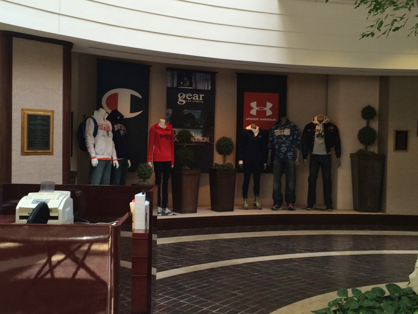
A few weeks ago my graphic design class went to GEAR for Sports to see how a t-shirt is printed and also the new trending styles of print, both on clothes and paper. 

Who is GEAR for Sports?

Gear is the only print part of a huge corporation that also includes Under Armour and Champion. What Gear prints the designs on the clothing, from college logos to custom prints. Their custom printing and mass production rates can print out 15,000 shirts a day. They offer 1-12 color range (meaning almost any color) and shiny prints.

 Of course different designers design different things, which I saw first hand how they separate the designers form pants, caps, t-shirts, long sleeves, socks, the list can go on and on. Each team is made of a smaller group of designers who meet with clients and then give the final decided print file to the co-workers who do the printing on large scale machines. The machines look like giant octopuses with a lot more ink choices. 


What I found interesting is how they decide what type of ink and fabric the client would want as see above. There's a bunch of fabrics bound together that the client can choose from and the printed t-shirts have the color and code printed together for easy choosing. 


Monday, April 20, 2015

eMagine Awards

2nd Place in Character Animation

On April 4, during the eMagine awards I won 2nd place for a character animation that I am extremely proud in.

A character animation.

I'm not an animation student.

I'm a graphic designer.

This makes me really proud in my GIF making abilities. 
Look how happy I look. This was me accepting my award. 

 This is a re-edit of my Waterbending GIF earlier this year that I cleaned up and added more frames. I took out the little faces I drew while making this which kind of took out the personality of my drawings in the process but made it look more professional. No worries, I still have the original file save. 

The animation teacher saw my older GIFs and told me to clean it up and add more frames it would hit pretty high in the score board and that's exactly what I did. 
If I was to do anything different, I would have entered in another work which would have been another double exposure with a vector overlay but I didn't know that you can enter in more that one entry to other categories. I plan to do just that next year. 

Friday, March 6, 2015

Design Challenge - Double Exposure

What is Double Exposure?

Double Exposure is a photographic technique that combines 2 different images into a single image. This technique has become popular recently because of programs able to create these images like Photoshop. 


What makes this trend so beautiful is the overlaps of images and how you can put two images into one while still having both showing clearly or to add an extra effect. Adding a vector can draw your eyes to an invisible or faded area of the image. It can represent an important area not seen or even highlight the image. 

This was my recreation of the double exposure with a brain vector. I redrew some areas of the image and added a little more color while I did the double exposure tutorial here.

Monday, February 9, 2015

How To Make a GIF

What is a GIF?

 A GIF (pronounced 'JIF')stands for Graphic Interchange Format and can be used for small animations and low-resolution film clips.

Background History

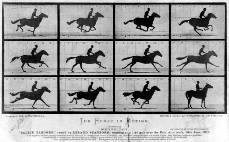
Eadweard Muybridge was a great and famous photographer who later created the Zoopraxiscope which worked by showing a sequence of still photographs in rapid succession. If you've seen Tarzan, it's that wheel of pictures that Jane showed him that spun and the pictures slowly showed the first motion graphics.


A GIF of a Zoopraxiscope
 GIFs were first used in 1987 by Steve Wilhite that retained a compressed format. It started as another way to advertise things via web but really didn't last long in the purpose. From advertisement it went to art, a way to show movement without sound that didn't take up as much space as a video. 


GIFs are mainly used on Tumblr since it took up GIF formats. Now you can make GIFs from videos or pics and can be used on almost any website and on mobile devices.


Thursday, January 15, 2015

Leadership Strengths

Last Friday, e-Comm students took a test to find our strengths and see how we tick. Similar to last year when we took a personality test and I received the letters ISTJ. I also took the test and found out my strengths as well as my weaknesses.


My Top Five Strengths

1) Intellection

I enjoy thinking, some mental games,generally I am the kind of person who rather be thinking rather than talking. I believe this fits me well for I am also a bit of an introverted person who enjoys the company of few. 


2) Analytical

It means that I challenge people by asking for proof, and facts rather than opinions or assumptions. It sounds a bit cold and demanding but the value remains unhindered. I look for patterns or connections to things and link them together. 


3) Deliberative

As a private person, I want my personal space but don't mind if a friend is the one to pop my personal bubble. I don't want to take risks unless I have a good grip of the possible outcome, otherwise I'll play it safe. I plan ahead and don't enjoy having plans mess up. I give credit where credit is do instead of handing them out freely. 

4) Harmony

I rather avoid a useless argument or look for an option where there would be little friction. With people who hold different view, I sometimes act as a mediator. I don't see the reasons for enforcing a particular view on someone else and I strongly believe in respecting others opinions and differences even if they are different from your own. Differences don't matter much as long as there's no bashing of a view. 

5) Input

I love collecting information. I like collecting facts or things only whispered of as well as material objects like pictures. I like to travel to learn new things and expand my view of the world as well as people. 

My Domains 

Strategic Thinker

From this test, it deemed me as a Strategic Thinker. I think this is pretty accurate but someone else might think differently. 
Intellectionanalytical, and input are all under Strategic Thinker category.

Executing

Deliberative is under Executing, or the let's go do this kind of person. 

Relationship Building

And Harmony is under Relationship Building, which I'm a bit surprised in this because I don't exactly try to build relationships and rather let them happen on their own. 

Influencing

I have nothing in Influencing, which I'm not surprised about and kind of laughed. I don't try to influence others but rather agree, disagree, or find common ground. 


Thursday, December 18, 2014

What is Graphic Design?

After several last minute changes to our final project this is it. To me, 'What is Graphic Design'? A question that changes for me every year since freshman year. Graphic design still retains to me as a form of art, but more or less the form of it still changes. 

I searched in Google what graphic design and it said "the art or skill of combining text and pictures in advertisements, magazines, or books." A relative answers but also boring. Graphic design is art; its a collaboration of different elements and principles created through digital means. 

Pictures Can Say More Than Words


To get back to the basics, graphic design was also used to record data.
Cave paintings to record people and also hunts.

Egyptian Hieroglyphics brought in the first pictures and words together to tell a story.

The Process of Graphic Design


The process of graphic design first must be learned. A problem turns to a concept, designing and building is the longest process and goes back and forth for a long time, then the product and representation method or medium is decided. A long but exciting process.

Graphic design always starts with ideas and sketches. This was from my info graphic and also served to fuel my other works when I was stuck. Sketches are an important to keep.


The creating process and designing takes the longest time. It can also be the most frustrating when you just can't seem to get something to work.
I created T-shirt layout and this was one of the most frustrating projects I've ever done. In this example the layer orders had to be in the right place and the right filters for my idea to work. The designs were individually made in Illustrator and then carried over to photoshop where the layers clashed and I had to relayer everything. 

Building the layout I had to switch back and forth from the two programs. When making a design with more than two programs, make sure the files are compatible with the other programs.


Being a Graphic Designer

You have to be flexible about designs and who you work with. Try to see things from all points of view and make sure that it's something you both can agree on. 

Keep up to date with the styles and know what is appropriate for the time. Don't try to put slang in with whatever you're trying to do unless you know for certain it's the correct use unless you want to look stupid. 


Here is my final T-shirt design. I see a bunch of galaxy designs everywhere and I really like it. A black shirt because everything goes with black and white text because it shows up for both the sweatshirt and e-Comm logo. I made the logo with a clipping mask that took a while to remember how to do and a lot of frustration and screaming. 

I wear a lot of black and white text looks great with it. I've been really liking all the galaxy prints everywhere and would buy the design if it wasn't so expensive. This has been my best project yet.


Wednesday, December 10, 2014

Infographics

The topic I chose for the info-graphic project was 'How to Take Care of a Pet'. Naturally i chose a cat.


I started with sketches of what I've researched on how to take care of cats/kittens. Most of the tips came from ASPCA (for some reason) and petco.com
Many ideas went through my head and lot of paper wasted on my sketches. After talking to my classmates I finally decided on which sketch to use.


After this was bringing my final sketch to the computer and turning it into a digital sketch that served as a template. I had a quick layout and notes on the paper that i could easily turn off the layer. I first traced the image in photoshop then dragged that file into illustrator where i finished it up and added the information I've simplified.


This is the final print. I'm actually pretty happy on how it turned out. I was going for a pretty simple look and maybe a bit elegant from how I vectored the cat and made the lines bolder on some areas. It gives it this heavier feeling especially to the tail.


The hardest problem I faced was during the vectoring process. I've never really been good at it but this is something that I went over so many times trying to get it perfect. I did ask for some help from people who were good at it and I asked for a lot of feedback too. I switched a lot between photoshop and illustrator and lost a few thing along the way but i thankfully found them again. If I was to do this again i would change the animal or change the topic. Instead of going for a simple look I would go for more of a lively and colorful look. 

Tuesday, November 11, 2014

VML Field Trip

Yesterday we took a trip to VLM near the KC Airport. We got to meet Executive Creative Director  Aaron Evenson and he talked about his job and answered our questions about the industry. 


For the time we were there, I got the just of the entire industry; 

  • The entire industry is based on opinions, if your design is good or not
    • You need to stand out
    • There is no right or wrong
  • This is a skill you need to build up over years of work
    • Experience is something of a must have
    • Keep track of all your experience 
    • Need to know whats cool so you can choose the right design
  • Maintain a blog or website
    • Its better than books or print
    • Fastest way of getting your name out to the world
    • Basically your portfolio
  • Teams will be interchangeable and can work on one or more project
  • You get to travel a lot and meet people
  • A team should only have one leader
    • Needs to be crystal clear on instructions
    • Draws boundaries but can still be leniant 
Also during the trip we got a tour of the department. I would really like to work there, everything looks so cool and the office cubes are all unique, some aren't even cubes, they're bubbles. The entire work place looks like a playground  for adults and all foods and drinks are stocked in the cafeteria.

Friday, November 7, 2014

Painting With Photoshop

Painting in Photoshop is my specialty. I'm pretty good with traditional art and I can draw pretty well with a tablet too. 

But landscapes aren't my style but I tried my best.
Above is the landscape we had to do. It was boring work so I played with the brushes throughout the process. You can see on the tree on the left when I really changed the brush styles. 
Next is the paint palette. We just had to mix some colors together which was pretty easy work. Clean the brushes, mix the colors, blending; these are all things you can do with traditional art just not as messy. 

This is my favorite painting we had to do. the calico's fur was set with water color and wet edges. Unfortunately the pixels on this was set really low compared to the kitten on the right. With the kitten on the right, he was painted with custom brushes that I've set on my computer.

Thursday, October 30, 2014

10/24 Field Trip

Last Friday we took a trip to downtown KC and went to the Bill Brady Gallery. They had this really awesome display up. Literately up, hanging from the ceiling. The artwork was called 'WILD FUSION" by Michael Manning. What I really loved about this art was that it was a all on a screen with smaller 'worlds' around it. The worlds were made of small glass open orbs filled with sand and something else to make it look like it was living. 


You can see above of the hanging screen and the huge painted canvas all suspended by wires. The entire exhibit was huge.


Above, this is one of my favorite things I saw last week. It looks kind of creepy but I just thought it was so cool. This was un-named at the Unplugged  project where we went back to their back rooms where they conduct their meetings. 


Tuesday, October 7, 2014

Gradient Mesh


An apple and a rose gradient mesh created in Illustrator. 
I vectored to my greatest ability, but I've never been good in Illustrator. 

The gradient apple was created after I watch a tutorial online, I tried from a book but that doesn't work very well and can be confusing. It's best to watch from a video so you can follow an example. When choosing to vector something that you know that you'll have to color, try something simple first, something that doesn't have that much bends and shadows to. Trying to add a gradient mesh to something like an apple is rather difficult and I don't recommend doing. Its harder than what needs to be. Secondly, make sure you know what you're doing. Read ahead or watch the video ahead before you go in, and make sure you know your keyboard short cuts cause that will help a lot. Ask for help, I mainly asked people I knew sort of what they were doing, this was a really challenging project for something we've never done before. I tried this project to my best ability but this doesn't come naturally to me at all, especially trying to add a nice highlight. 

  The next project worked better. Something that was flat but still looked nice. The rose was a bit hard to vector but I simplified the petals to what you see below. 
       
I spelt my name out in a font I've seen that i really like. Actually, instead of just typing the words out I created them. I replaced the 'i' in my name with the rose itself. It gives the whole thing a more dramatic flare. To convert text to outlines, simply select your text and go to FILE-CHOOSE TYPE-CREATE OUTLINES expand the group and then you're free to play. I added extra anchor points with the pen tool and shaped them however i liked. 
I don't really know why I chose a rose, I just thought that i would try a different style as I usually do and simplified the lines. I've always liked the quote "Every rose has her thorns" and I guess thats how I ended up creating this. The font I wanted to model my text after was from a show called RWBY. I trie to make the flower look like some areas are glowing too. 


Monday, October 6, 2014

Anatomy of a Font

We took a perosnality test on font types, and I got the font Bifur.  Someone with the bifur font type is rational, assertive, progressive, and relaxed. Some of these i can agree with but other don't sound like me.  I don't really like this font mainly because its hard to read (the numbers), some letters are just fine. 

I typed my name out after downloading the font and it looks pretty cool. It's a bit hard identifying some of the font parts. I did the ones i was pretty confident about. Whatever you type this font on it defiantly shouldn't be on anything busy, the text itself is already a lot to look at. Again, like i said before, the font is a bit hard for me to read but it does catch eyes. 


Studio Gibili Posters


If you have ever seen these two faces, you know exactly what the movie is even before  you read the title. 
A friend asked me to create the Anime Club poster for this school year, the first meeting will be showing one of my personal favorite Studio Gibili films. Something easy that if anyone has any idea of anime, they'll at least recognize this mask. It's one of the simplest ideas i could come up with that has a fully recognizable face, or in this case a mask. 

This is one of the most famous animated films ever, its called Spirited Away that was created in 2002 by Studio Gibili , a Japanese animation company.  
The poster does not have a room number to it because my client asked for a drawing with the words "Anime Club" written on it, and asked to be sent without the room number. 
This poster has 6 colors, but the design is so simple one of the posters in the room in front of me that has 3 colors looks busier. 
I love how simple the poster looks. I love when people haven't even seen the movie, yet they recognize this face. 


This poster I just did for fun. Another one of my favorites and a good one at that. I wrote in light green the name of the film in Japanese. My Neighbor Totoro, created in 1988 by Studio Gibili, is a spirit who protects children, but the original story like most turned movie, has a dark twist. 
This poster was just for fun but I just loved this so much I also wanted to post about it.