Thursday, December 18, 2014

What is Graphic Design?

After several last minute changes to our final project this is it. To me, 'What is Graphic Design'? A question that changes for me every year since freshman year. Graphic design still retains to me as a form of art, but more or less the form of it still changes. 

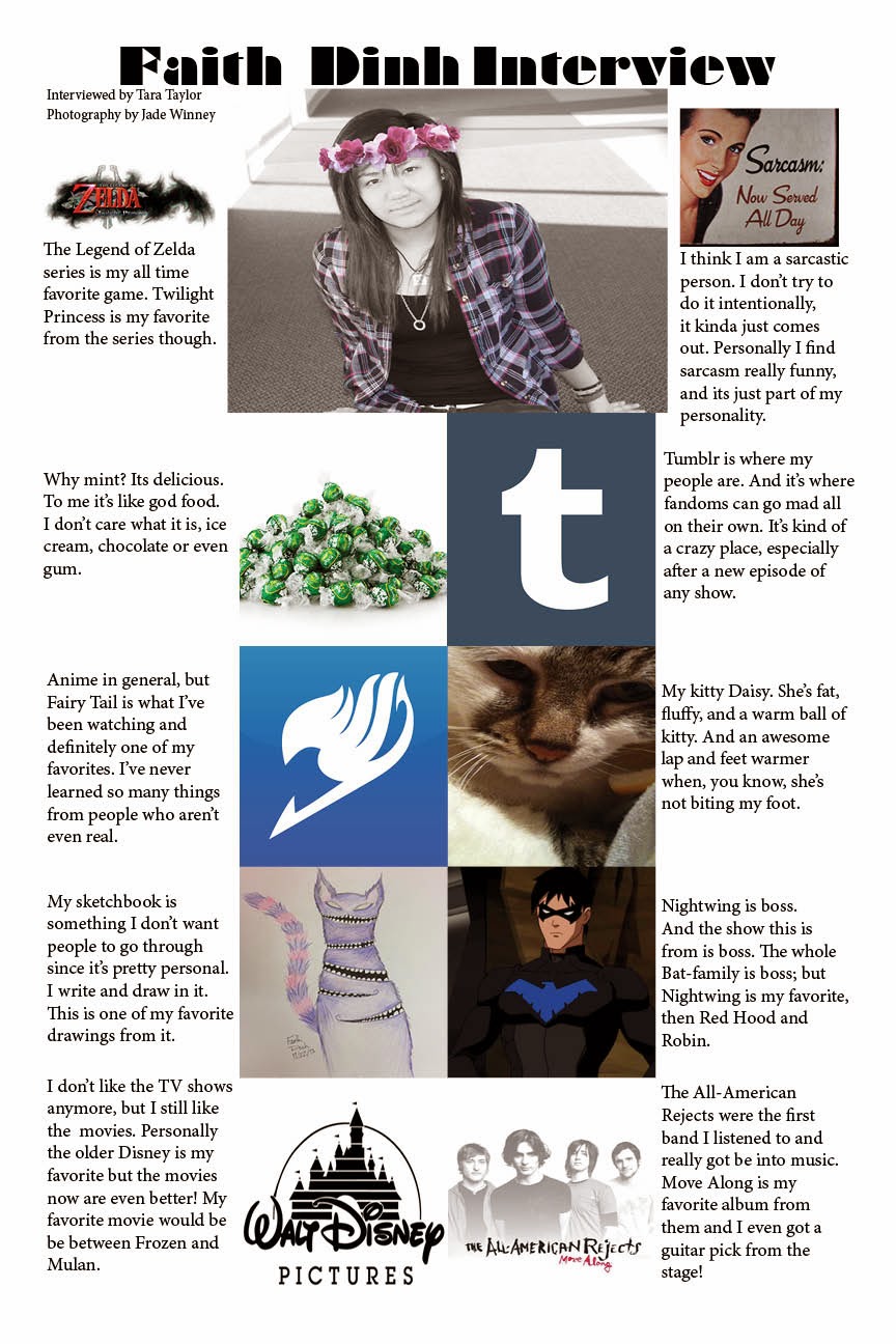
I searched in Google what graphic design and it said "the art or skill of combining text and pictures in advertisements, magazines, or books." A relative answers but also boring. Graphic design is art; its a collaboration of different elements and principles created through digital means. 

Pictures Can Say More Than Words


To get back to the basics, graphic design was also used to record data.
Cave paintings to record people and also hunts.

Egyptian Hieroglyphics brought in the first pictures and words together to tell a story.

The Process of Graphic Design


The process of graphic design first must be learned. A problem turns to a concept, designing and building is the longest process and goes back and forth for a long time, then the product and representation method or medium is decided. A long but exciting process.

Graphic design always starts with ideas and sketches. This was from my info graphic and also served to fuel my other works when I was stuck. Sketches are an important to keep.


The creating process and designing takes the longest time. It can also be the most frustrating when you just can't seem to get something to work.
I created T-shirt layout and this was one of the most frustrating projects I've ever done. In this example the layer orders had to be in the right place and the right filters for my idea to work. The designs were individually made in Illustrator and then carried over to photoshop where the layers clashed and I had to relayer everything. 

Building the layout I had to switch back and forth from the two programs. When making a design with more than two programs, make sure the files are compatible with the other programs.


Being a Graphic Designer

You have to be flexible about designs and who you work with. Try to see things from all points of view and make sure that it's something you both can agree on. 

Keep up to date with the styles and know what is appropriate for the time. Don't try to put slang in with whatever you're trying to do unless you know for certain it's the correct use unless you want to look stupid. 


Here is my final T-shirt design. I see a bunch of galaxy designs everywhere and I really like it. A black shirt because everything goes with black and white text because it shows up for both the sweatshirt and e-Comm logo. I made the logo with a clipping mask that took a while to remember how to do and a lot of frustration and screaming. 

I wear a lot of black and white text looks great with it. I've been really liking all the galaxy prints everywhere and would buy the design if it wasn't so expensive. This has been my best project yet.


Wednesday, December 10, 2014

Infographics

The topic I chose for the info-graphic project was 'How to Take Care of a Pet'. Naturally i chose a cat.


I started with sketches of what I've researched on how to take care of cats/kittens. Most of the tips came from ASPCA (for some reason) and petco.com
Many ideas went through my head and lot of paper wasted on my sketches. After talking to my classmates I finally decided on which sketch to use.


After this was bringing my final sketch to the computer and turning it into a digital sketch that served as a template. I had a quick layout and notes on the paper that i could easily turn off the layer. I first traced the image in photoshop then dragged that file into illustrator where i finished it up and added the information I've simplified.


This is the final print. I'm actually pretty happy on how it turned out. I was going for a pretty simple look and maybe a bit elegant from how I vectored the cat and made the lines bolder on some areas. It gives it this heavier feeling especially to the tail.


The hardest problem I faced was during the vectoring process. I've never really been good at it but this is something that I went over so many times trying to get it perfect. I did ask for some help from people who were good at it and I asked for a lot of feedback too. I switched a lot between photoshop and illustrator and lost a few thing along the way but i thankfully found them again. If I was to do this again i would change the animal or change the topic. Instead of going for a simple look I would go for more of a lively and colorful look. 

Tuesday, November 11, 2014

VML Field Trip

Yesterday we took a trip to VLM near the KC Airport. We got to meet Executive Creative Director  Aaron Evenson and he talked about his job and answered our questions about the industry. 


For the time we were there, I got the just of the entire industry; 

  • The entire industry is based on opinions, if your design is good or not
    • You need to stand out
    • There is no right or wrong
  • This is a skill you need to build up over years of work
    • Experience is something of a must have
    • Keep track of all your experience 
    • Need to know whats cool so you can choose the right design
  • Maintain a blog or website
    • Its better than books or print
    • Fastest way of getting your name out to the world
    • Basically your portfolio
  • Teams will be interchangeable and can work on one or more project
  • You get to travel a lot and meet people
  • A team should only have one leader
    • Needs to be crystal clear on instructions
    • Draws boundaries but can still be leniant 
Also during the trip we got a tour of the department. I would really like to work there, everything looks so cool and the office cubes are all unique, some aren't even cubes, they're bubbles. The entire work place looks like a playground  for adults and all foods and drinks are stocked in the cafeteria.

Friday, November 7, 2014

Painting With Photoshop

Painting in Photoshop is my specialty. I'm pretty good with traditional art and I can draw pretty well with a tablet too. 

But landscapes aren't my style but I tried my best.
Above is the landscape we had to do. It was boring work so I played with the brushes throughout the process. You can see on the tree on the left when I really changed the brush styles. 
Next is the paint palette. We just had to mix some colors together which was pretty easy work. Clean the brushes, mix the colors, blending; these are all things you can do with traditional art just not as messy. 

This is my favorite painting we had to do. the calico's fur was set with water color and wet edges. Unfortunately the pixels on this was set really low compared to the kitten on the right. With the kitten on the right, he was painted with custom brushes that I've set on my computer.

Thursday, October 30, 2014

10/24 Field Trip

Last Friday we took a trip to downtown KC and went to the Bill Brady Gallery. They had this really awesome display up. Literately up, hanging from the ceiling. The artwork was called 'WILD FUSION" by Michael Manning. What I really loved about this art was that it was a all on a screen with smaller 'worlds' around it. The worlds were made of small glass open orbs filled with sand and something else to make it look like it was living. 


You can see above of the hanging screen and the huge painted canvas all suspended by wires. The entire exhibit was huge.


Above, this is one of my favorite things I saw last week. It looks kind of creepy but I just thought it was so cool. This was un-named at the Unplugged  project where we went back to their back rooms where they conduct their meetings. 


Tuesday, October 7, 2014

Gradient Mesh


An apple and a rose gradient mesh created in Illustrator. 
I vectored to my greatest ability, but I've never been good in Illustrator. 

The gradient apple was created after I watch a tutorial online, I tried from a book but that doesn't work very well and can be confusing. It's best to watch from a video so you can follow an example. When choosing to vector something that you know that you'll have to color, try something simple first, something that doesn't have that much bends and shadows to. Trying to add a gradient mesh to something like an apple is rather difficult and I don't recommend doing. Its harder than what needs to be. Secondly, make sure you know what you're doing. Read ahead or watch the video ahead before you go in, and make sure you know your keyboard short cuts cause that will help a lot. Ask for help, I mainly asked people I knew sort of what they were doing, this was a really challenging project for something we've never done before. I tried this project to my best ability but this doesn't come naturally to me at all, especially trying to add a nice highlight. 

  The next project worked better. Something that was flat but still looked nice. The rose was a bit hard to vector but I simplified the petals to what you see below. 
       
I spelt my name out in a font I've seen that i really like. Actually, instead of just typing the words out I created them. I replaced the 'i' in my name with the rose itself. It gives the whole thing a more dramatic flare. To convert text to outlines, simply select your text and go to FILE-CHOOSE TYPE-CREATE OUTLINES expand the group and then you're free to play. I added extra anchor points with the pen tool and shaped them however i liked. 
I don't really know why I chose a rose, I just thought that i would try a different style as I usually do and simplified the lines. I've always liked the quote "Every rose has her thorns" and I guess thats how I ended up creating this. The font I wanted to model my text after was from a show called RWBY. I trie to make the flower look like some areas are glowing too. 


Monday, October 6, 2014

Anatomy of a Font

We took a perosnality test on font types, and I got the font Bifur.  Someone with the bifur font type is rational, assertive, progressive, and relaxed. Some of these i can agree with but other don't sound like me.  I don't really like this font mainly because its hard to read (the numbers), some letters are just fine. 

I typed my name out after downloading the font and it looks pretty cool. It's a bit hard identifying some of the font parts. I did the ones i was pretty confident about. Whatever you type this font on it defiantly shouldn't be on anything busy, the text itself is already a lot to look at. Again, like i said before, the font is a bit hard for me to read but it does catch eyes. 


Studio Gibili Posters


If you have ever seen these two faces, you know exactly what the movie is even before  you read the title. 
A friend asked me to create the Anime Club poster for this school year, the first meeting will be showing one of my personal favorite Studio Gibili films. Something easy that if anyone has any idea of anime, they'll at least recognize this mask. It's one of the simplest ideas i could come up with that has a fully recognizable face, or in this case a mask. 

This is one of the most famous animated films ever, its called Spirited Away that was created in 2002 by Studio Gibili , a Japanese animation company.  
The poster does not have a room number to it because my client asked for a drawing with the words "Anime Club" written on it, and asked to be sent without the room number. 
This poster has 6 colors, but the design is so simple one of the posters in the room in front of me that has 3 colors looks busier. 
I love how simple the poster looks. I love when people haven't even seen the movie, yet they recognize this face. 


This poster I just did for fun. Another one of my favorites and a good one at that. I wrote in light green the name of the film in Japanese. My Neighbor Totoro, created in 1988 by Studio Gibili, is a spirit who protects children, but the original story like most turned movie, has a dark twist. 
This poster was just for fun but I just loved this so much I also wanted to post about it.

Wednesday, September 10, 2014

Cubes

In Illustrator, we created perfectly symmetrical cubes using the line tool and rotate tool from Lynda.com.

Each cube is 50 pixels across on the suit and later transferred over to Photoshop for small editing. 
The center angle is 120, rotated and copied 3 times. 
The opposite side is Alt+ drag and then joined together and colored.
From a tutorial again Lynda.com,  I learned how to copy and past at angles. Color and created a 3D colored cube.

Afterwards, I created my own cube art of sorts. If you recognized this logo, it's the Nintendo Game Cube logo. I've always loved this logo and I took this as an opportunity to re-create it. This is one of my favorite game systems even though there wasn't that many games from it that I enjoyed. But This logo is my favorite non the less.


Friday, August 29, 2014

What is Graphic Design?

Graphic design is communicating through the internet using the power of words and pictures.

It's communicating with people and trying to make them feel what you are feeling using only the internet.

 Concept

Idea 

Life

It is a language for the living.
We see it in every aspect of our daily lives. Everything we eat and by is convoid by graphic design. 

Sometimes it must be intricate, other times it must me subtle; but it must capture the attention of the people. If you must use something, make it interesting. If it's interesting then people will want to be there.

Match books, posters, and book covers are just examples of graphic design.


This is the new book cover for Fahrenheit 451 by Ray Bradbury.
Now, almost everyone has read the novel and know that in this future, fire fighters burn books. With this book cover, it gives the book some irony with the match and striker side to actually light the book ablaze. 

Graphic designers need to communicate with the people, know what's up, and how the current times are. With graphic design the world wouldn't be the same as it is now.

Wednesday, May 21, 2014

eComm Magazine Cover

To me, eComm is art on the internet. A way anyone in the world can look at your artwork. That's why I joined eComm.
I kept the edges shaded over because to me, I still have a lot to learn. The center is lightened more because that's what I do know. In the center I put words that barely scrape the surface of what I can put into words. The texture in the back is of a brush that I slashed around the page, it's of all the projects that I've created and of the works that we all have done. This is one of the best projects I've done that I'm actually pleased on how well it turned out. No overbearing guide lines or "creative borders" that I've hated from the very first day.
The 6 blue names on top are the teachers.

Video- I didn't go into this strand mainly because I wasn't good at it. Allam and Morris teach Video class and it breaks into 2 different strands. Broadcasting and Entertainment. Broadcasting deals with the school news while entertainment dealt with the Katy Perry music video for "Roar".

Web Design- I dabbled in web design last year because it was a requirement, and I wasn't really fond of it either. It's taught by Olson. Web design you create websites for small companies and yourself.

Animation- I chose this as my second eComm class. It's taught by Netterville. In animation you create 3D models and animate them or add special effects to videos like fire or glass orbs containing something inside. I am fairly good in this.

Graphic Design- The main eComm branch I went into. We create posters, magazine cover, and other things as well. Its taught by Lofquist as the main teacher, and Revelle and Olson teach the freshmen enrolled in e9 a little graphic design. The image above is the result of my time in this eComm branch created in both Photoshop and Illustrator.

Monday, May 12, 2014

My Logo

 A Logo is a symbol or other design adopted by an organization to identify its products, 
uniform, vehicles, etc.
To me, a logo should capture whatever you're trying to do into a small image. Nothing too extravagant, something simple. 
My colored logo.

 My black and white logo.


I personally like the black and white one more because I prefer to not have color. The colored logo looks great I like how it turned out but its more for looks than pleasing to me. 

With my logo design, it actually looks good with any color; I believe black to be the default color. 

Thursday, May 1, 2014

Frozen Orb

Glass Orbs to Frozen Orbs

The tutorial I chose was the Glass Orb tutorial and i started this tutorial just how this Andrew guy started it.

A smudge image that I applied the CC Sphere effect to. I created two copies of this layer, one set normally and the second which was in front, set mode to inverse, and the opacity turned really low. To animate this layer it took me a day to figure out you're suppose to  alt +click onto the stop watch on the y-axis and type in "time*20". This took me so long to figure out...


   After about this time I decided I liked this background as the reflection than the one the tutorial called for. I found this image after searching for a city panorama and created a sphereized version of it in After Effect. I created a mask to smooth out the edge to make it look seamless. 
Masked and then CC Sphere again. This took me a good day to figure out how to make this longer too. I realized after a while you're suppose to pre-compose the layer. 

I put a circular mask in the center of the sphere and then feathered out the edges. I turned the mask layer off to create a somewhat transparent look.   


By now I decided I didn't want to do exactly what the man doing the tutorial did so I started to do things on my own. He recommended a CC Curves effect and I played with the colors. I put a snow effect later and then added the sphere effect again to make the snow inside the orb.  
I added a background using two separate layers. I added a grey solid layer and let that sit. Then I took an icy floor image and squished that to half screen and added a mask to feather out the top to making it blend. On the layer with the light effects I messed with that layer again and made a nice glow to it. 

This tutorial was really simple and only a few time I didn't understand the video. This was the second tutorial I did after the first one which was the light ribbons required a plug-in that was never mentioned until I was half way through the video. I'm happy I switched projects since this looks a lot nicer than I thought it would be and I could do this again with other images. 


Friday, April 11, 2014

Last Saturday, I attended the eMagine festival. It's where e-Communication students and other students from around the area apply their skills and see if they are good enough to win an award from 17 different categories.
I didn't submit anything this year, and would not submit anything next year either because I doubt I could do anything like the people did.
My favorite submission from the festival was from an animation category.  It was called 'RED V.S. BLUE' and I was very excited to hear the name and know where the creator got his or her idea. The idea was from Rooster Teeth's 'Red vs Blue' web series. The animation was almost flawless and well made throughout the entire length. This was my favorite piece of the night.

Kerning


Kerning is the adjustment of space between text. There was a kerning game that I've played several times  I'm not good at kerning manually because this took too long, about 30 minutes worth of work that I spent doing this. This too a bit too long for my liking and I have been loosing patience. 
Kerning is important in graphic design because it is the space between the letters of a text. It applies to typography greatly and is an important thing to learn when doing anything with text.

Wednesday, April 9, 2014

Google Logo

I love this picture of the Google Logo because it's just so eye pleasing. the Google logo looks like paint splats thrown into the air that were shaped into the logo.  How each of the letters are shaped and the paint flying through the air is really amazing an stunning on how realistically it was made. The colors are the same but the each letter in the font won't look the same as any other.

10 Things I Can't Live Without

This interview is about what I can't live without. The poster was created by me, I was interviewed by Tara Taylor and the photography was done by Jade Winney. Everything on my list of what I can't live without, except one, is all materialistic. The only thing I can't live without that isn't materialistic is sarcasm, because it's a part of me. Not the best part, but it is a part non the less. There's a line somewhere between sarcasm and sass somewhere in there but I don't want to find it. 

If I could add more to my list then I would also add coffee. Not bought coffee, coffee I make at home. I would add coffee because by now, because of school, coffee would be my blood type. 

Friday, April 4, 2014

Cinderella Movie Poster

For the movie poster I chose the 1950's film Cinderella and incorporated the original story into the poster. The original story was by Jacob and Wilhem Grimm, known for their horrendous fairy tales such as Snow White, Rupunzel and Sleeping Beauty. If you would like to read the original Cinderella story it is here. I recommend reading the original story so you can see the differences in the poster.
The movies you are thinking of are from Disney, who, created extremely watered down versions for kids.

The poster I created incorporated both the movie and the original story. For my poster, I simplified the more specific parts. A glass slipper (from the movie, in the story it was gold) and a hand seeing who would fit the slipper. The blood inside the shoe is from the story where the step-sisters cut off parts of their feet. The main colors i used were red, light blue, and a light skin tone. Black as back ground and white for text and some small sparkles. The sparkles can represent from the story, the tears that fell from her face. Or from the movie, the wish her Fairy God Mother granted her. 

I'm comparing my poster to Saul Bass' poster of West Side story. I tried to simplify Cinderella into a small picture that's extremely simple. Both posters use at maximum five colors. Bass uses 3 colors. Both posters sum up the entire movie in just a little picture. Bass created his own font for his poster too.

Thursday, March 27, 2014

Plausible Imposible

Dopy from Snow White was washing his face and he dunks his head under the water. He had water in his head/ears. As annoying as it is, its impossible to blow the water out of your head. But it seems possible to do so and realistic when you can do the same to something thats stuck. This method works on a plane when your ears feel the pressure though.

 Here again, Dopy was trying to grab the soap but it keeps slipping away and he accidentally ends up swallowing it. Soap bars are extremely slippery and hard to grab so that is plausible. But the soap bar itself is too large to swallow. I don't think that it is possible to try but you are always willing to. Feel free to try and tell me!
 The dwarfs are eating soup and and Snow White interrupts them saying that they are not eating gentlemen like. She teaches them how to eat properly but they still slurp. When they slurp, they slurp so hard they suck up the soup from their spoon. It seems possible and may actually can be possible if you try hard enough. The motion from this is similar to something light being sucked up by a vacuum. But soup is fairly heavy and you'll need a lot of force to do so.
As the dwarfs are slurping the soup, Dopy of course, slurped so hard he swallowed his spoon. This is highly impossible and would probably choke and die. Dopy also hick-ups bubbles from the soap bar he swallowed as well. Those two are very impossible. But it does seem possible if you have ever have had soap in your mouth and you sneeze.
The other dwarfs are trying to get the soap out of Dopy and of course, they kick him! Its not possible but kicking things do sometimes work. They kick the soap and spoon out of him like you would kick the snot out of someone. It seems possible but its not plausible.


Monday, February 3, 2014

This sculpture from created by Anne Lindberg in order to "provide emotion responses". 

I don't see the meaning behind the sculpture at all. I don't really understand modern art at all, especially the ones that end up in a museum. It looks cool, but I can't see the meaning behind it.
The sculpture itself is really interesting in the part that all of it is created by hand, using colored thread. 
I myself did not attend the field trip, but I liked this sculpture out of all from the ones I was to to search.
I still don't understand the "emotional responses" its suppose to give you, but the way the thread is layered so carefully, and slowly changes colors. The thread goes form one wall to the other side and some other works similar to this is all one string. The complexity and time it took to create is something I lack in and could never do. Especially the patients to create this.