Last Saturday, I attended the eMagine festival. It's where e-Communication students and other students from around the area apply their skills and see if they are good enough to win an award from 17 different categories.
I didn't submit anything this year, and would not submit anything next year either because I doubt I could do anything like the people did.
My favorite submission from the festival was from an animation category. It was called 'RED V.S. BLUE' and I was very excited to hear the name and know where the creator got his or her idea. The idea was from Rooster Teeth's 'Red vs Blue' web series. The animation was almost flawless and well made throughout the entire length. This was my favorite piece of the night.
My name is Faith, I am a graphic designer on my free time. I am a junior (soon to be senior) at my high school. Some of these posts are projects that were assigned and others are projects that I really wanted to share to everyone.
Friday, April 11, 2014
Kerning
Kerning is the adjustment of space between text. There was a kerning game that I've played several times I'm not good at kerning manually because this took too long, about 30 minutes worth of work that I spent doing this. This too a bit too long for my liking and I have been loosing patience.
Kerning is important in graphic design because it is the space between the letters of a text. It applies to typography greatly and is an important thing to learn when doing anything with text.
Wednesday, April 9, 2014
Google Logo
I love this picture of the Google Logo because it's just so eye pleasing. the Google logo looks like paint splats thrown into the air that were shaped into the logo. How each of the letters are shaped and the paint flying through the air is really amazing an stunning on how realistically it was made. The colors are the same but the each letter in the font won't look the same as any other.
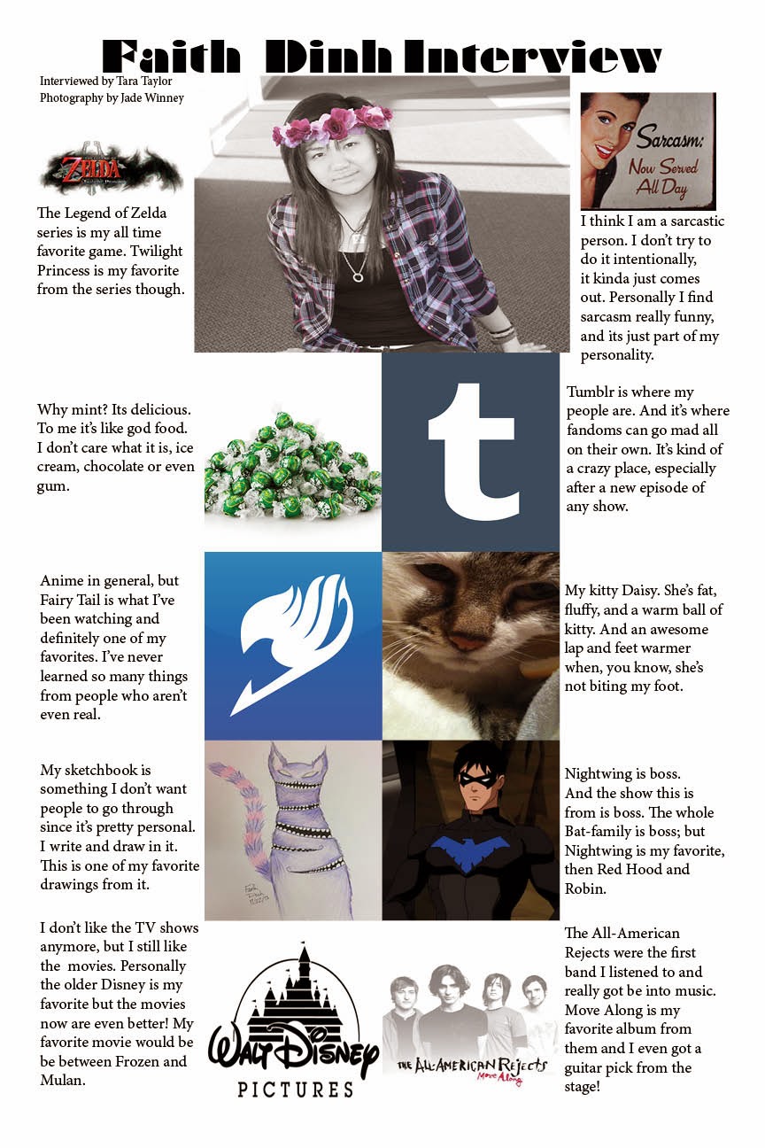
10 Things I Can't Live Without
This interview is about what I can't live without. The poster was created by me, I was interviewed by Tara Taylor and the photography was done by Jade Winney. Everything on my list of what I can't live without, except one, is all materialistic. The only thing I can't live without that isn't materialistic is sarcasm, because it's a part of me. Not the best part, but it is a part non the less. There's a line somewhere between sarcasm and sass somewhere in there but I don't want to find it.
If I could add more to my list then I would also add coffee. Not bought coffee, coffee I make at home. I would add coffee because by now, because of school, coffee would be my blood type.
Friday, April 4, 2014
Cinderella Movie Poster
For the movie poster I chose the 1950's film Cinderella and incorporated the original story into the poster. The original story was by Jacob and Wilhem Grimm, known for their horrendous fairy tales such as Snow White, Rupunzel and Sleeping Beauty. If you would like to read the original Cinderella story it is here. I recommend reading the original story so you can see the differences in the poster.
The movies you are thinking of are from Disney, who, created extremely watered down versions for kids.
The poster I created incorporated both the movie and the original story. For my poster, I simplified the more specific parts. A glass slipper (from the movie, in the story it was gold) and a hand seeing who would fit the slipper. The blood inside the shoe is from the story where the step-sisters cut off parts of their feet. The main colors i used were red, light blue, and a light skin tone. Black as back ground and white for text and some small sparkles. The sparkles can represent from the story, the tears that fell from her face. Or from the movie, the wish her Fairy God Mother granted her.
I'm comparing my poster to Saul Bass' poster of West Side story. I tried to simplify Cinderella into a small picture that's extremely simple. Both posters use at maximum five colors. Bass uses 3 colors. Both posters sum up the entire movie in just a little picture. Bass created his own font for his poster too.
Subscribe to:
Comments (Atom)


