Tuesday, May 19, 2015

ID Package

As the end of the year approaches, we were face with the problem of marking our progress as Graphic Designers. I am finishing up my Junior year and setting a bar which I need to surpass next year as my Senior year grows near. 

Junior ID Package

Logo RE-Design


At the beginning of my Sophomore year I created a logo which I've decided to redo and try and improve. The original was used with the wrong color codes and look awful compared to the new and improved colors.

These are my new logos.

My official Logo
The reason for my color choice is that the colors go in order of CMYK or Cyan, Magenta, Yellow and Key. I chose those colors because I am a graphic designer and these are printing colors. 


When creating a logo, it's important to think of what kind of background colors it would be on and a black and white version and how the colors should  be arranged. 


My logo on a button looked a bit odd, and adding the ears to the button itself looks really cute. I tried cutting off the ears but it doesn't look like my logo without the ears. 


ID Package 

Resume

This is my resume that contains a lot of my skills and can be used in a real job application. 
I repeated the same colors in my logo through out the resume except for the color yellow because the color does not show up on white backgrounds very well. Spacing is very important in this resume as the columns in the middle, sides, and in between the divisions are all evenly distributed. 


For my font, different variations of the font 'Open Sans' was used because it is a simple font and very easy to kern. I used the 'light' font style throughout my resume to give words a light feeling and switched between that and 'regular'. 

Branding

Who am I?

Faith means to believe.
 

I am folders full of GIFs.

I am a poorly timed joke; a small doodle on the side of my notes that the teacher compliments on .


I an idea that's been left in a folder but not forgotten. 

I am an artist who's medium can be on paper,digital, or by sound. 

Monday, May 11, 2015

GEAR Fieldtrip

GEAR Fieldtrip

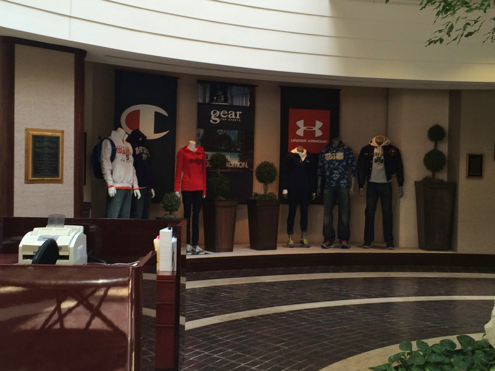
A few weeks ago my graphic design class went to GEAR for Sports to see how a t-shirt is printed and also the new trending styles of print, both on clothes and paper. 

Who is GEAR for Sports?

Gear is the only print part of a huge corporation that also includes Under Armour and Champion. What Gear prints the designs on the clothing, from college logos to custom prints. Their custom printing and mass production rates can print out 15,000 shirts a day. They offer 1-12 color range (meaning almost any color) and shiny prints.

 Of course different designers design different things, which I saw first hand how they separate the designers form pants, caps, t-shirts, long sleeves, socks, the list can go on and on. Each team is made of a smaller group of designers who meet with clients and then give the final decided print file to the co-workers who do the printing on large scale machines. The machines look like giant octopuses with a lot more ink choices. 


What I found interesting is how they decide what type of ink and fabric the client would want as see above. There's a bunch of fabrics bound together that the client can choose from and the printed t-shirts have the color and code printed together for easy choosing.